
Rendering Scents
How I used Blender to create realish rock-faces for a package-design mockup
Context:

While I want to highlight my exploration of Blender on this page, the context, as with every project, is very important. This was created for my third-year package design course, where the brief was to design a cologne box followed by a mockup advertisement. After selecting a scent from a random assortment of samples, we were off to the races.
Before starting the mockups, I sketched a variety of box concepts. I've learned that the user experience of opening a package is vital; you want it to feel like a "grand reveal" that is both memorable and engaging.
The cologne I chose was shaped like a Coca-Cola bottle and filled with a thick, orange fluid. This inspired a natural approach. My first design utilized the idea of a sky opening up to reveal a rice field and the product itself. However, I found the colors of the sky and grass didn't pair well with the orange hues of the bottle. Instead, I pivoted to recreate the feel of a red-rock mesa, where the user "digs" through the sand to reveal the product. I chose the latter direction, as I felt it was much more compelling.

Designing the
package:
With my sketches in place, I opened Illustrator to work out my die-lines. A couple of test prints later, I had the manufacturing process for the box figured out. In contrast to my original sketches, I opted for a cleaner, "less sandy" look. I found that without using stock photos, I couldn't create a realistic enough texture for the sand; I now realize, however, that Blender would have been the perfect tool for that exact purpose!


Finally blender:
I had yet to use Blender for any "official" projects, and my experience was basic at best. However, I will always take any excuse to learn a new program. The Blender community offers a wide variety of robust tutorials, and I’m incredibly grateful to the creators who help beginners find their way.
To the right are the two tutorials that helped me the most. To summarize: the first explains a technique for turning a die-line into a folded package. By importing an SVG from Illustrator, I could place slices along the folds, which allowed me to "fold" the box digitally. I then added a Solidify modifier to give the paper depth and a Bevel modifier to soften the edges. Below, you can see a close-up of how the folds of the solidified box interact, providing a realistic feel.
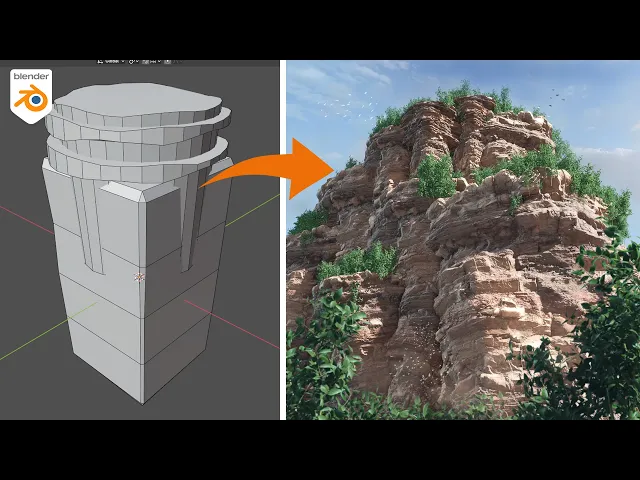
The second tutorial focused on the rocks I wanted to place beneath the box. This process was much more challenging to master and explain. Essentially, the technique for creating an authentic rockface involves using Displace and Remesh modifiers to combine multiple shapes into a single "blob," which is then roughed up to look like stone. After that, I used Blender’s sculpting tools to fine-tune and add detail where needed.
After applying my box textures and sourcing a free rock texture online, the scene was ready for export. The biggest challenges I faced were missing small steps that required retroactive fixes; when you aren't familiar with a piece of software, a single wrong keystroke can disrupt the entire file. At one point, I accidentally disabled a section of the GUI, but it’s mistakes like these that provide the best learning opportunities. Below is the final poster, which I’m quite proud of.


The type was done in Procreate, thanks for reading!